A plant manager finds out at the 8 AM shift review that the previous night's OEE was 61%, below the 75% weekly target. The problem was fixable at 2:14 AM, when a single machine dropped out of tolerance and ran a bad product for four hours before the shift change caught it.
The 8 AM meeting is not a review. It is a post-mortem. The decision window closed six hours earlier. A real-time production dashboard would have surfaced that event at 2:14 AM, not the next morning.
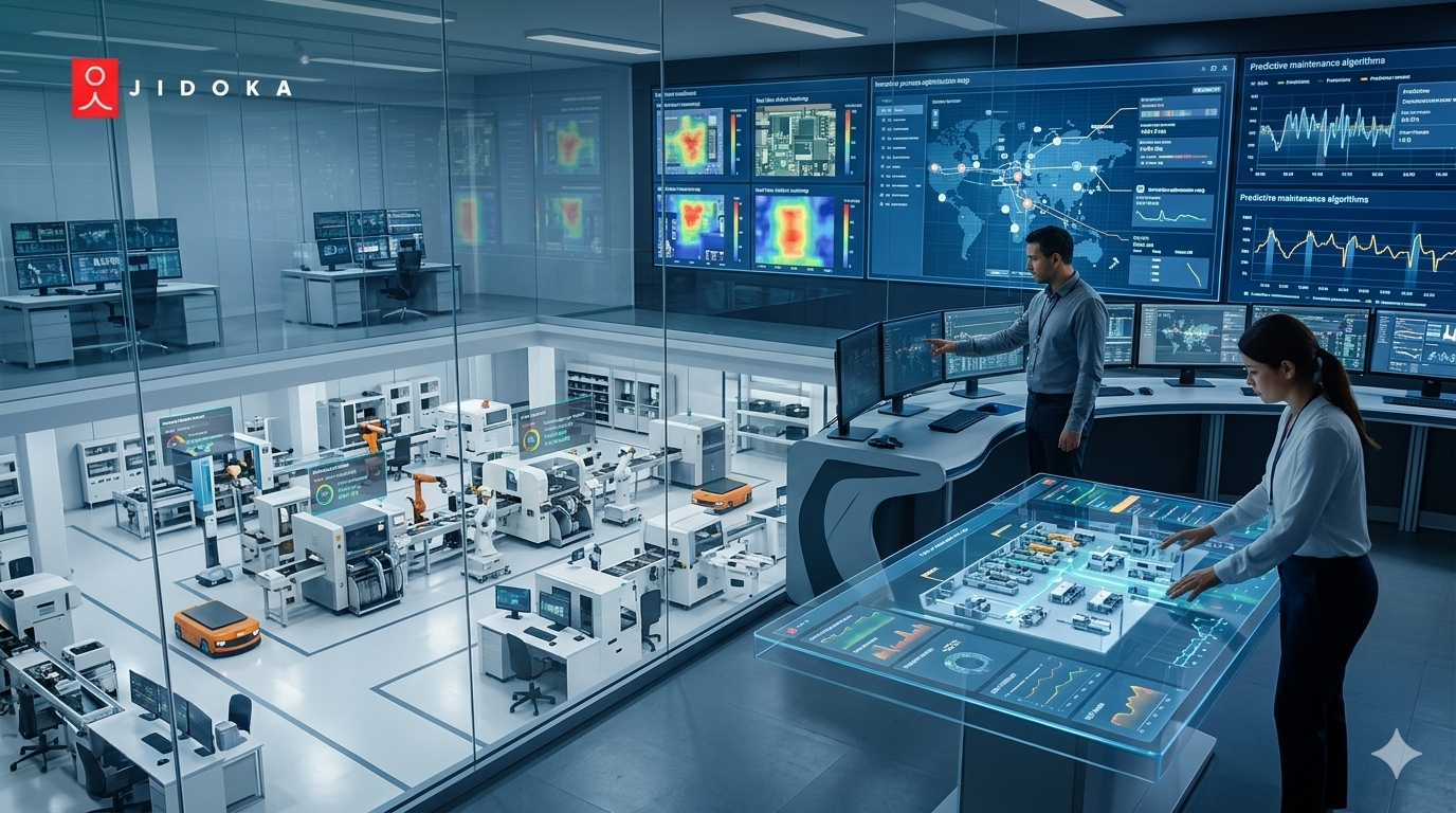
A manufacturing KPI dashboard works when it shows the right metrics to the right person at the right decision speed. The 12 key production indicators every plant manager needs in real time are divided into three tiers: four operational KPIs for shift-level decisions, four financial KPIs for management reporting, and four strategic KPIs for leadership alignment, all drawn from the same live data feed, aggregated differently for each audience.
Why Most Manufacturing Dashboards Fail to Drive Decisions
Most manufacturing kpi dashboards fail not because the data is missing but because the design shows every metric to every person at the same update frequency. Operators need event-level alerts at sub-minute refresh. Plant managers need trend data by shift and line. Executives need aggregated manufacturing performance indicators versus target over weeks.
Plants without real-time OEE dashboards average 33% more unplanned downtime and 2.4x higher scrap rates than facilities with live production kpi monitoring (iFactory, May 2026). The data gap is not about technology. Facilities already collect enough data. The failure is in how it is organized and presented.
The 24-to-72-Hour Data Latency Problem
Most plant managers currently receive production reports compiled 24 to 72 hours after the events they describe. By the time a problem surfaces in a weekly report, three more shifts have passed and three more intervention windows have closed (iFactory FMCG analytics, May 2026). A daily report is a historical record. A real-time production dashboard answers the question 'what is happening right now and what do I do in the next 10 minutes?'
One Dashboard for Every Role Is a Design Error
Operators on the shop floor need: current shift output versus target, active quality alerts, line status, and downtime event status. They do not need multi-week OEE trends. Plant manager kpi needs are different: OEE by line for current and prior shift, OTIF performance, top quality loss drivers. Executives need plant-to-plant benchmarks and rolling OTIF. A single screen serving all three audiences serves none of them well.
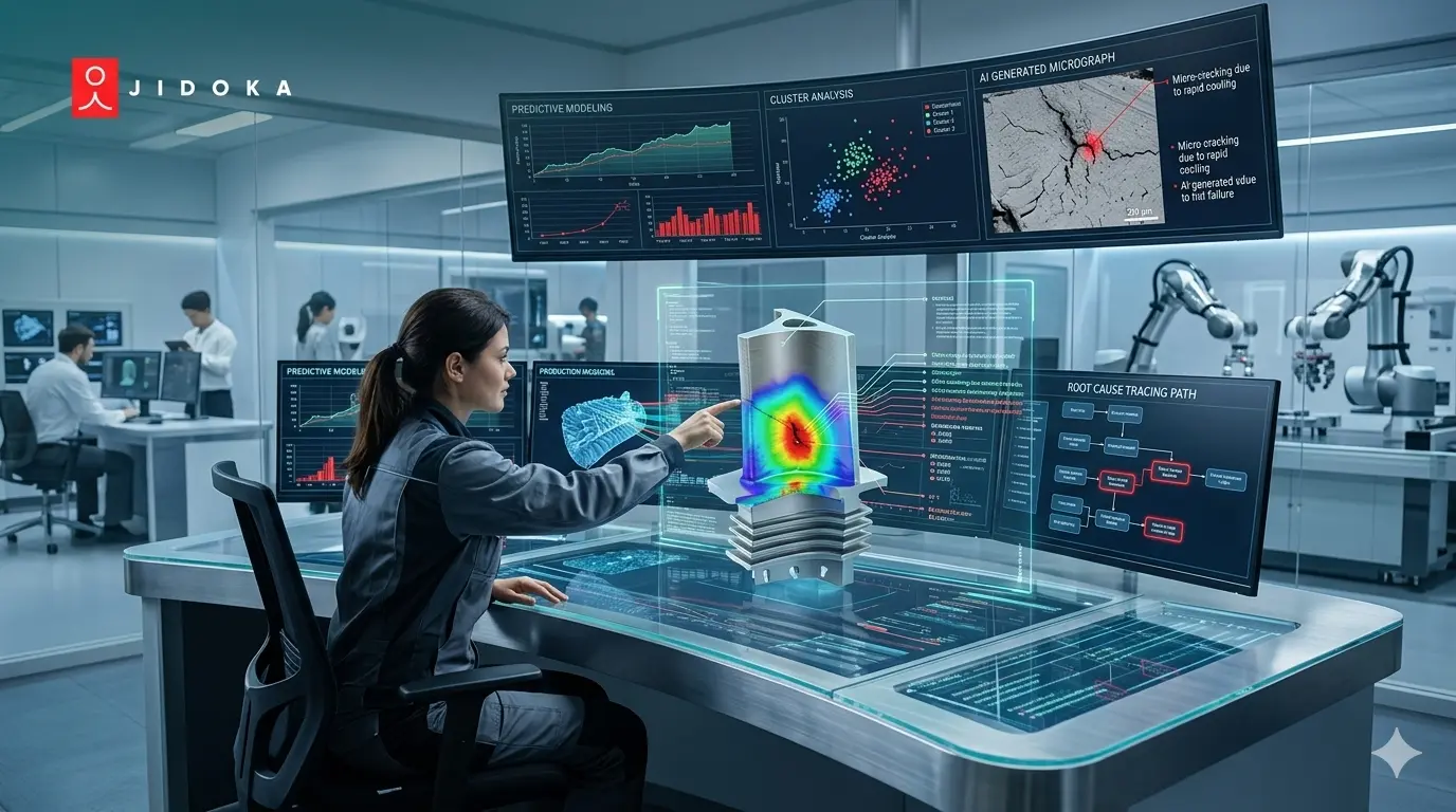
No Drill-Down Capability Surfaces Problems Without Causes
A factory metrics real-time display that shows 'OEE dropped to 61%' is marginally useful. A display that shows 'OEE on Line 3 dropped to 61% at 02:14 because Machine 4 generated 847 rejects across 4 hours' gives a plant manager a decision. The KPI without the drill-down path is a warning light with no diagnostic code. Both structures show the same headline number. Only one drives action.
The 12 Manufacturing KPIs Every Plant Manager Dashboard Must Include
The 12 key production indicators are organized into three tiers. Each tier uses the same underlying data, aggregated at a different time horizon for a different decision speed. A manufacturing kpi dashboard that mixes all three tiers on one screen gives everyone a partial picture. Separate role-specific views give each user a complete one.
Source for tier structure and benchmark targets: TeepTrak Manufacturing KPI Dashboard US 2026.
Tier 1: Operational KPIs (Shift-Level, Sub-Minute Refresh)
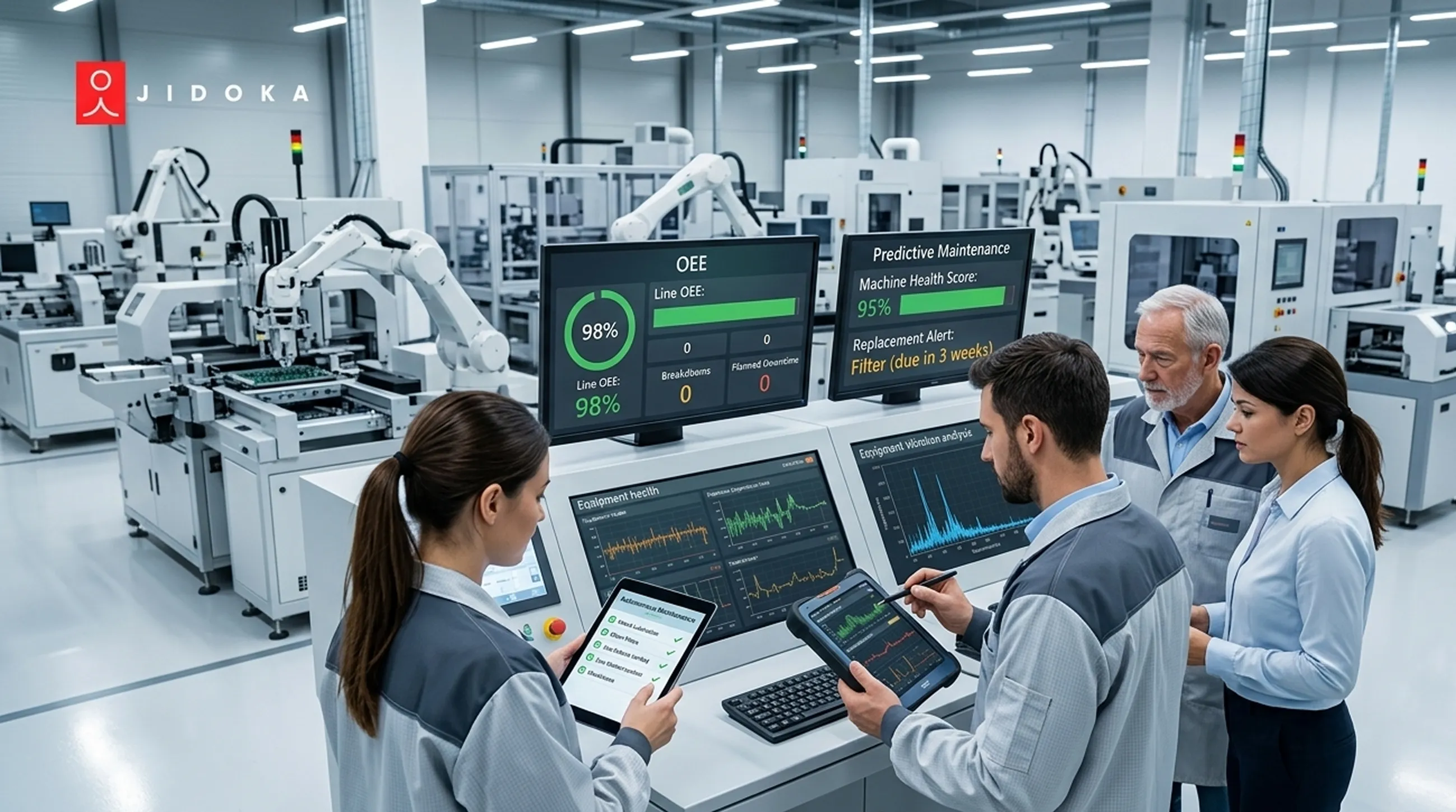
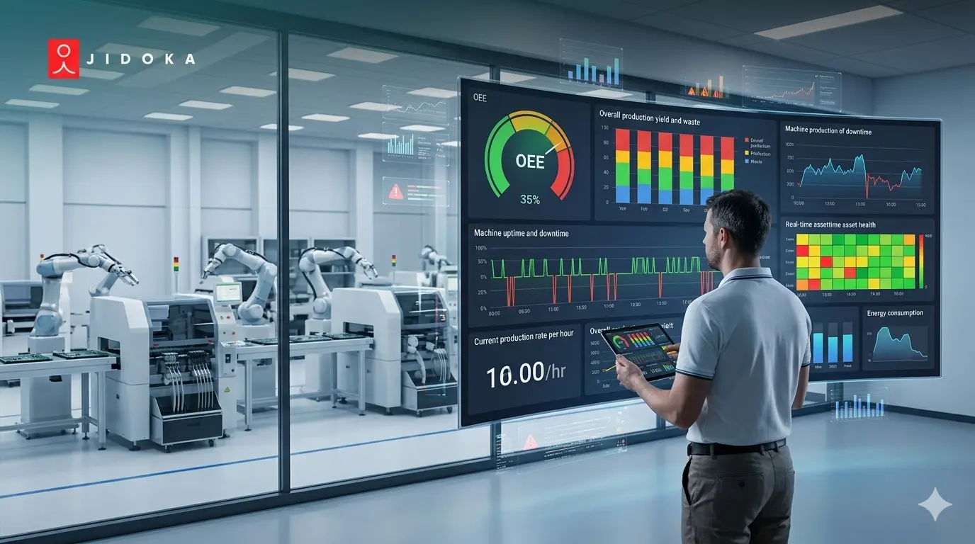
1. Overall Equipment Effectiveness (OEE)
OEE = Availability x Performance x Quality. World-class target: 85% or above. Most manufacturing plants start at 55 to 65% (TeepTrak Manufacturing KPI Dashboard US 2026). Each percentage point improvement represents recovered capacity. For a high-volume FMCG line, a 2% OEE gain can represent millions in annual recovered value.
2. First Pass Yield (FPY)
FPY = Good units produced on first pass / total units produced. Target: 95% or above for most manufacturing environments. The Quality component of OEE equals FPY at the line level. When FPY drops, factory performance metrics tracking should flag it at the operator level before it shows in the aggregate OEE score.
3. Scrap Rate
Scrap rate = scrapped units / total units produced. Target: under 2% for most production environments. A scrap rate spike is the trigger for defect analysis. Production defect analysis begins with a scrap rate that has crossed a threshold and needs root cause investigation.
4. Downtime Rate
Downtime rate = unplanned downtime / available shift time. Target: under 5% unplanned downtime. Downtime classified by cause (machine, material, operator, changeover) enables the root cause analysis that prevents recurrence. An unclassified downtime event is a closed intervention window.
Tier 2: Financial KPIs (Shift Summary, 5 to 10 Minute Refresh)
5. Schedule Adherence
Actual output versus planned output per shift, per line. Target: 90 to 95% or above. Schedule adherence below target is the first warning of OTIF risk. The plant manager who sees schedule adherence at 84% at 14:00 has four hours to recover. The one who reads it in the next-day report does not.
6. Cost of Poor Quality (COPQ)
COPQ = scrap cost + rework cost + warranty cost per period. Target: reduction year over year. COPQ is the financial translation of FPY and scrap rate. It connects quality performance to the P&L language that earns a budget for quality improvement investment.
7. Rework Rate
Rework rate = units requiring rework / total units produced. Target: under 3%. Rework is a hidden cost that scrap rate does not capture. A facility with a 1% scrap rate and 8% rework rate is spending significantly more on quality failures than the scrap figure suggests.
8. Inventory Turns
COGS / average inventory. Industry-specific targets. Inventory turns link manufacturing throughput to supply chain efficiency. Low turns on finished goods indicate production outpacing demand or quality holds creating distribution backlogs.
Tier 3: Strategic KPIs (Weekly and Monthly View)
9. On-Time In-Full Delivery (OTIF)
OTIF = orders delivered on time and in full / total orders. Target: 95 to 98% or above for most manufacturing sectors. OTIF is the customer-facing translation of OEE, FPY, and schedule adherence. A plant with a 92% OEE and 71% OTIF has a planning or logistics problem separate from the quality performance.
10. Customer Return Rate
Returns / units shipped. Target: under 0.5% for most manufacturing categories. Customer return rate is the escape rate the production dashboard cannot prevent by itself. It reflects what inspection missed. A rising return rate triggers both root cause analysis and FMEA Detection score review.
11. Safety Incident Rate
Safety incidents per 100,000 hours worked. Target: zero. Safety is a leading indicator of process quality discipline. Facilities with strong process adherence cultures, which NAGARE process monitoring reinforces, consistently show lower safety incident rates alongside lower quality defect rates.
12. Energy per Unit
Total energy consumption / units produced. Target: year-over-year reduction. Energy per unit links production efficiency to ESG performance. An OEE improvement that reduces machine idle time also reduces energy consumption per unit without a separate initiative.
How AI Vision Feeds the Manufacturing KPI Dashboard in Real Time
The dashboard latency problem has a single structural cause: the data feeding it arrives from manual entries made at shift end. KOMPASS and NAGARE eliminate that step. Inspection and process events log automatically, in real time, with no shift-end data entry required.
KOMPASS Feeds FPY and OEE Quality in Real Time
AI vision systems like KOMPASS feed First-Pass Yield and OEE Quality data directly into the manufacturing kpi dashboard by logging every inspection event: accepted, rejected, defect type, timestamp, line, and lot, at production speed without manual entry. This eliminates the 24 to 72 hour latency gap and enables FPY and OEE Quality components to update in real time as production runs.
The factory performance metrics tracking benefit is structural: when KOMPASS logs a defect cluster at 02:14 on Line 3, the FPY signal on the production dashboard drops in real time. The shift supervisor sees an alert. The intervention decision is a current-shift decision, not a next-morning post-mortem.
NAGARE Feeds Downtime Classification and Schedule Adherence
NAGARE monitors every production cycle against the approved digital SOP, logging deviations, downtime events, and process compliance by station, operator, and shift. Every downtime event is automatically classified by cause, eliminating the end-of-shift manual entry that leaves downtime categories blank or listed as 'other.'
Schedule adherence, OEE Availability, and downtime rate all flow from NAGARE's process event log. The operational tier view updates every 30 seconds to 2 minutes from NAGARE's continuous output, giving shift supervisors the current-shift picture they need to make intervention decisions before the shift closes.
The Combined Effect: Decisions at Decision Speed
The combined dashboard that KOMPASS and NAGARE feed together operates at three decision speeds simultaneously. Operators see FPY, scrap count, and line status updating in near-real-time. Plant managers see shift-level OEE and schedule adherence trending every 5 to 10 minutes.
Operations directors see weekly OTIF and COPQ from the same data feed, aggregated to the reporting horizon they need. Same 12 KPIs. Three audiences. Three decision speeds.
Manufacturing KPI Dashboard Design Principles That Drive Action
A manufacturing kpi dashboard that shows 12 KPIs on one screen is not a dashboard. It is a spreadsheet with a gradient. Three design principles separate dashboards that drive action from dashboards that accumulate in browser tabs: tier by audience, match refresh to decision speed, and build the drill-down path from aggregate to event.
Principle 1: Tier by Audience, Not by Metric
Each of the 12 KPIs belongs to a specific tier's view. Key production indicators for operators (FPY, scrap live, line status, downtime alert) should not appear on the executive view. OTIF rolling and plant benchmarks should not appear on the operator screen. The architectural decision is to design three separate views from the same data, not to add a filter to a single view.
Principle 2: Match Refresh Rate to Decision Speed
Operator-facing dashboards should refresh every 30 seconds to 2 minutes for active factory metrics real-time production metrics. Plant manager kpi dashboards should refresh every 5 to 10 minutes for operational KPIs and every shift for financial metrics. Executive dashboards refresh weekly or monthly. Update frequency that mismatches the audience's decision speed either overwhelms the user (too fast) or makes the data stale before they can act (too slow).
Principle 3: Drill-Down From Aggregate to Event
Every aggregate KPI on a well-designed production dashboard should have a drill-down path to the underlying event. 'OEE = 61%' should drill to 'OEE on Line 3 = 51%, driven by 847 quality rejects from Machine 4 between 02:14 and 06:28.' That drill-down is what converts a warning into a correctable event. Without it, the KPI tells the plant manager something went wrong but not where, when, or what to do.
Jidoka Technologies and Real-Time KPI Visibility
KOMPASS and NAGARE eliminate the manual data entry step that creates 24 to 72 hour reporting lag. FPY, OEE Quality, downtime classification, and schedule adherence update in real time across all three dashboard tiers.
- KOMPASS: Real-time defect detection feeds FPY and OEE Quality component without shift-end data entry. Alert triggers at threshold breach.
- NAGARE: Process event logging feeds downtime classification, schedule adherence, and operator compliance to the operational tier. Every event timestamped and cause-coded.
- Industries: Active across automotive, FMCG, electronics, and pharmaceuticals.
See how KOMPASS and NAGARE feed the operational, financial, and strategic KPIs your manufacturing kpi dashboard needs atoka-tech.
Conclusion
The plant manager reading about Tuesday night's OEE problem on Wednesday morning is not making a production decision. They are writing a report about one. Plants with real-time dashboards average 33% less unplanned downtime because the decision window stays open.
See how KOMPASS and NAGARE feed the operational, financial, and strategic KPIs your manufacturing kpi dashboard needs at jidoka-tech.ai.
Frequently Asked Questions
1. What Is a Manufacturing KPI Dashboard and Who Should Use It?
A manufacturing KPI dashboard is a real-time display of the key production indicators that measure plant performance across quality, equipment efficiency, delivery, cost, and safety. It should be configured for three distinct audiences: operators (shift-level operational data), plant managers (daily and weekly trend data), and executives (strategic performance versus multi-quarter targets), with each audience seeing a different aggregation of the same underlying data.
2. What Is a Good OEE Target for a World-Class Manufacturing Plant?
A world-class Overall Equipment Effectiveness (OEE) target is 85% or above, but most manufacturing plants start at 55 to 65%. An OEE of 85% means the plant is producing 85% of its theoretical maximum good output. For a high-volume FMCG line, a 2% OEE gain represents millions in annual recovered capacity value (TeepTrak Manufacturing KPI Dashboard US 2026).
3. What Is the Difference Between First-Pass Yield and OEE on a Manufacturing Dashboard?
First-Pass Yield (FPY) measures the percentage of units produced correctly on the first pass without rework; OEE combines Availability, Performance, and Quality into one score where the Quality component equals FPY at the line level. Both metrics belong on the plant dashboard because OEE shows the total equipment performance picture and FPY isolates the quality contribution, enabling faster root cause investigation when quality drops.
4. How Often Should a Real-Time Factory Dashboard Refresh?
Operator-facing dashboards should refresh every 30 seconds to 2 minutes for active production metrics; plant manager dashboards should refresh every 5 to 10 minutes for operational KPIs and every shift for financial metrics. Update frequency should match the decision speed of the audience. A shift supervisor needs to know if the line is trending toward a quality failure in the next 15 minutes, not the next morning's report.
5. How Does AI Vision Feed a Manufacturing KPI Dashboard in Real Time?
AI vision systems like KOMPASS feed First-Pass Yield and OEE Quality data directly into the manufacturing KPI dashboard by logging every inspection event at production speed without manual entry. This eliminates the shift-end data entry step that creates the 24 to 72 hour latency gap in most plants, and enables factory performance metrics tracking in real time as production runs.